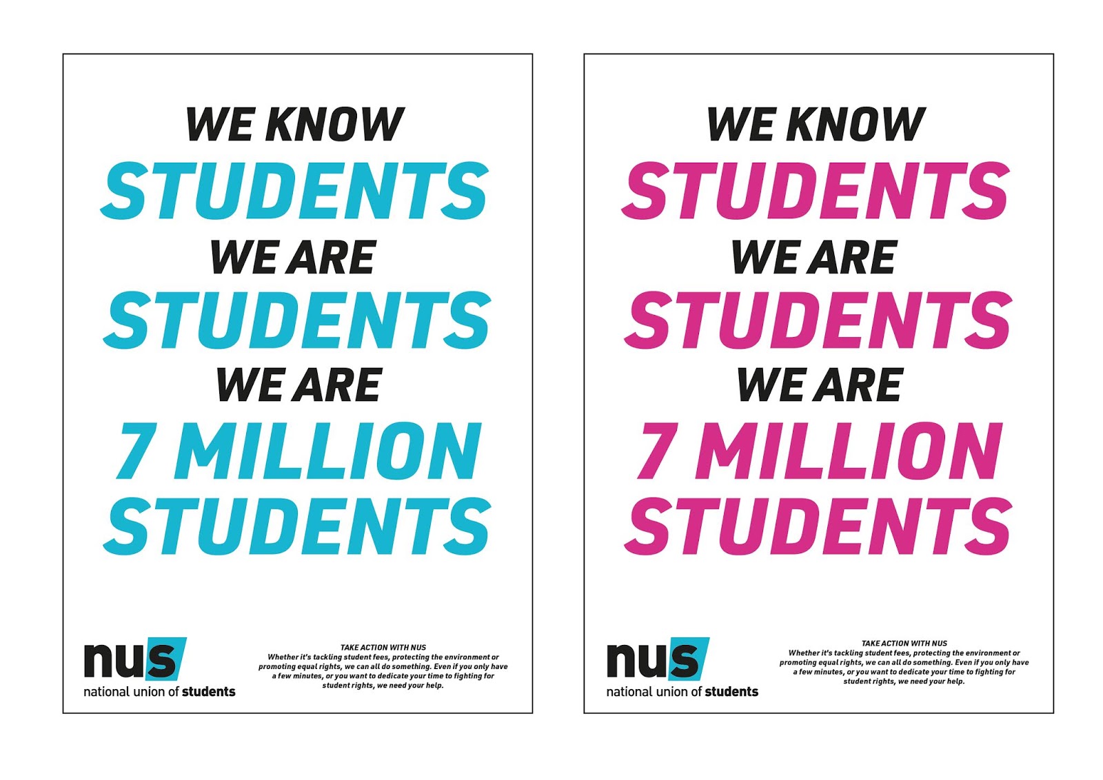
POSTER DESIGNS


At the end of my initial ideas, I choose these designs as my campaign branding guidelines. My next step was to explore in what way to utilise the colour palate to make the most out of the design. The differences between the two designs above and below are quite minor, simply an invert of the colours in the typography. However, I wanted to see which variations worked better and stood out more. I found that the 'key' terms ('students' and 'your rights') were bolder and more obvious when they were in white, and the other text in pink/blue. This was also confirmed in my feedback, so therefore this is the chosen guidelines for the designs to come. I will continue to use both pink and blue backgrounds, as my feedback confirmed to be appropriate and more exciting, and will utilise the idea of a 'flexible' brand system (much like the 'Britain Stronger In Europe' campaign as discussed in my essay) so I can reach and appeal to a wider audience, as well as make my campaign more personal and approachable.


I will continue to highlight the 'key' terms I established during my initial ideas, to ensure that my campaign stays emotive and feels personally directed at my audience. By using emotive language, I found out during my essay, that the campaign will be more persuasive and connect more with the audience.


To extend the emotive impact of the campaign, I decided to design some posters that would directly speak to the audiences within the 'Liberation' side of the NUS. Linking back to my research into NUS, I found that they have 'Liberation' groups where they do work specifically connected to LGBT+, Black Students, Disabled Students, Trans Students and Women. These groups are part of my 'key' terms that I established earlier in the project. By adapting the posters to acknowledge these groups, I am not only highlighting the work NUS is doing, but also connecting to the audience members that may be part of any of these groups on a more personal level. By making the audience members feel acknowledged and speaking directly to them, I make the campaign more emotive and therefore more successful. (My essay has revealed that emotion makes a campaign more memorable and successful.)
 |
Logos from the other branches of NUS, adapted to be the colour white so they could fit into
the branding guidelines of the campaign.
|
To continue on the route of inclusivity and emotive design, I wanted to acknowledge also the different branches of NUS. The main is NUS Britain/UK, which has the standard logo. However, there is also NUS Scotland, NUS Wales and NUS USI (Northern Ireland). As I want the campaign to be nationwide, I thought it would be appropriate to adapt the campaign designs for the different countries/branches of NUS. In doing this, I am able to again connect with the student audience on a more personal level by giving them something they can relate to. I choose to do this using colour. By having the green from the NUS Scotland logo, for example, within the designs of the posters for Scotland, I give the audience visually something they are already familiar with. This makes the designs feel more comfortable and personal to the students, and therefore, more emotive. As already discussed, emotion is a big factor in the effectiveness of design, and so I have focused largely on it. Because the designs themselves are quite minimal, only using typography and colour, by focusing a lot on emotion, language and the way the posters communicate their message, I am able to elevate their success.
 |
| NUS Wales - Utilising the colour green from the logo, and the original NUS UK blue. Adapting the 'original' NUS UK poster design to appeal to the NUS Students in Wales. |
 |
| NUS Scotland - Utilising the colour pink from the logo, and the original NUS UK blue. Adapting the 'original' NUS UK poster design to appeal to the NUS Students in Scotland. |
 |
NUS USI - Utilising the colours pink, blue and yellow from the logo. Adapting the 'original' NUS UK poster design to appeal to the NUS Students in Northern Ireland.
|
SOCIAL MEDIA DESIGNS
 |
| Various Social Media content - can be posted as single still images, or collated into a gif. |
 |
| Various Social Media content - continuing the idea of inclusivity. The design above can be adapted to target specific audience groups. This also can be posted as still images, or collated into a gif/gifs. |
As the campaign is a 'flexible' one (the repeating and connecting factor being type and colour), when it comes to the social media designs I thought I could be a little more creative. I choose the dimensions of a square box so that these designs could be mostly applied to Instagram, however, they could also easily be applied to other social media platforms such as Twitter and Facebook. I realised after I had designed these that NUS does not have an Instagram account, however, this is not an issue. Because if this campaign was to be realised, an Instagram account would be created. This is because Instagram is a popular social media platform amongst students, and so NUS should ideally join the platform if they want to connect with their audience more.
 |
| Social Media Content - This design would come together as a gif. It animates the message within the posters - which gives the language and message of the campaign a more exciting and active role. |
 |
| Various Social Media Content - A variation of the gif above. Also presents the message of the campaign in a more exciting way. |
 |
Various Social Media Content - These designs would be posted as still images. Not all social media content should be gifs/moving image, as not everyone has access to viewing them. Also, internet speeds often make viewing gifs a hassle, so it would deter the audience if all content was gifs/moving. These still designs get the message of the campaign across but simply in different dimensions. The last two stills shows how the campaign guidelines can be adapted to show different information. Here, the NUS 'policy zones' are listed, and their slogan 'Take Action!'. The policy zones are part of the 'key' terms I wanted to highlight, and this still shows how the campaign is flexible enough to be able to communicate any and all
information that may be relevant.
|
Simply content for social media posts I know is not enough to engage the audience, so by creating graphics for the website, as well as headers for Twitter and Facebook, I am able to get the campaign message across even more clearly. Also, not everyone will bother to scroll through social media posts or click on them, so by having headers that promote the campaign on the home pages of the NUS social media platforms, it is more likely that the audience will be exposed to them.
 |
| Attempting to adapt the campaign branding to the Twitter header. I tried to incorporate both of the colours, however, in doing so I believe I steered a bit too far from the guidelines. Although the campaign is flexible, there is a certain degree to how far I can push each design element before it begins to look like it came from a different campaign. By having the pink merge as a gradient into blue and then back to pink, I believe that was too far, because no where else in the campaign was blue and pink used together in such a way. |
 |
| To fix my earlier design, I decided to scrap the blue gradient and use simply the pink I have been using throughout the campaign. This instantly revealed to work much better, because it links not only to the posters (the original content that the whole campaign is based off of), but also the previous social media posts/gifs I had designed. This Twitter header actually works in my favour, because it brings the campaign together a bit more, as well as being visually exciting and impactful. The colours and typography are definitely a good mix/choice. |
 |
| For the Facebook header, I decided to simply opt for the same tone and style as the Twitter header, and just altered the dimensions/composition to suit the space available. This I believe was the right choice because it doesn't confuse the audience, and keeps the campaign coherent throughout its social media channels. |
 |
| For the website, unlike the Twitter and Facebook header designs, I decided to use both the pink and blue backgrounds. This was because I saw an opportunity where I could do so without breaking the campaign branding guidelines. The website allowed for two different graphics to be placed on either side of the pages' content, and therefore this allowed me to place both pink and blue separately. For the language and placement, I also decided to utilise the website and instead of having simply a few words, I created the graphic so that it would continue down as the audience/viewer scrolls. This reinforces the message, as the message follows the audience as they browse the site. For the content, I simply decided to carry on the repetition seen in previous social media posts/headers, and reinforced this repetition as part of the campaign branding. |
MERCHANDISE - REAL-WORLD MEDIUM
Thinking back to my essay, as well as the feedback I had received, I knew that I wanted to create some form of merchandise. In my essay I explored how using a different medium effects the success of the design, and found that placing the designs in a real-world medium works very well and it allows a wider target audience to be reached. As this campaign is aimed at students, the best way to communicate with them in a real world medium would be merchandise. My feedback suggested things such as tote bags, t-shirts, printed posters, badges, stickers. I decided to create tote bags, t-shirts and badges. I choose these because I feel like these would be not just the most appealing to students, but also most effective in promoting the spreading the message of the campaign. When students use/wear this merch, they would not only be showing their support, but also promoting the campaign to other students by intriguing them.
 |
| Designs taken from the existing poster and social media designs. These could be placed on all merch - t-shirts, badges and tote bags. |
 |
| Designs taken from existing poster and social media designs. They can be placed on all merch - t-shirts, badges and tote bags. The background for these designs are white, to account for the reality that printing t-shirts/tote bags and badges that were completely pink/blue may not be possible. As the campaign is flexible, that leaves room for the design elements to be adapted to fit the reality of how the message of the campaign is communicated through merch. |
 |
| Tote Bags - the white background design applied to tote bags. This rather than the coloured ones would be more realistic in terms of production. I think the repetition works really well on the tote bags because it fills the space quite well and makes the tote bag look very engaging. |
 |
| T-Shirts - the white background designs also applied to the t-shirts, for the same reason of realistic production as the tote bags. The repetition however does not work as well on the t-shirts because of the material available, The repetition does not have the same continues and powerful affect as it does on the tote bags and the social media content. |
 |
| T-Shirts - The single worded slogans, such as the '7 million students' above, and this 'Take Action' here, work much better on the t-shirts because of their simplicity and minimalism. I believe these t-shirts, over the more busier ones, would be more popular and appealing to students due to current clothing trends of minimalistic and very stylized designs. |
 |
| Badges - the white background designs applied to the badges in order to cohere with the other merchandise. The badges to not seem very exciting, and sort of lessen the power of the campaign message. Maybe the size of the typography, or the restrictions of the circle make the designs feel a little bit boring and unexciting, it does not make the viewer/audience want to 'take action'. |
 |
| Badges - the coloured background designs work much better on the badges, as they instantly become more exciting and engaging visually. As far as production, badges with coloured backgrounds are not as un-realistic as the tote bags or t-shirts would be to make, so these designs seem the most appropriate and effective. They link really well to all the campaign content that's been produced so far, and are a great subtle show of support for the audience, if they are not too confident in showing their support through a tote bag or t-shirt. |