Introduction:
-
What is Graphic Design? What is political
campaigns/protest? How do they link?
-
What I will discuss: design elements, trends,
target audiences, social media, mediums, history.
Obama ‘Hope’ Poster:
VIRAL/PRINTED/ONLINE - POSTER
-
Most well-known/iconic.
-
Social media first came into play in politics.
Drove the campaign.
-
Spoke to a younger audience. Poster came from
‘underground’. Followed ‘Obey’ trend.
-
Was emotive/inspiring.
The design of ‘Hope’ poster…
-
“Allying a powerful simplicity to an optimistic
message, the poster achieves a perfect synthesis of image and text to
communicate the essence of the Obama vision”
-
Shepard Fairey “I felt I could implicitly
portray Obama as established enough to be worthy of an idealised portrait,
almost like a two-dimensional statue – patriotic and American rather than being
of any specific race.”
-
“helped mobilise a grass-roots movement”
-
“hope is promised but nothing is specific. It
invites the viewer to project their own desires into the icons’ imagination.”
-
“It showed Obama thoughtfully looking upwards
and to the right, into the distance towards the future hopes of the nation. It
symbolised the promise of things yet to come, yet to be imagined”
Power of Social Media…
-
Shepard Fairey “The ubiquity of ‘Hope’ image
demonstrates that grass-roots activism makes a difference and that none of us
are powerless.”
-
“One person can cause a rippling effect in
activism and forever change the destiny of a country”
-
“made technology integral to strategy,
generating unheralded levels of online advocacy.”
-
“Fairey’s creation was originally underground…
showcasing the possibilities of simple design that inspires and provokes.”
Argument…
-
“Once held up as an example of how a political
poster could bring about positive change in the world, now it perhaps serves as
a warning that its all just propaganda in the end.”
-
Shepard Fairey “Digital tools have in some ways
helped activism, but in other ways they have resulted in people doing things
that are merely convenient and symbolic only for them. It is not necessarily
meaningful in terms of how they participate in effecting change.”
Britain Stronger In’:
VIRAL/PRINTED/ONLINE – LOTS OF MERCHANDISE
-
Clean and minimal. Followed current trends. Had
a ‘flexible’ brand identity.
-
Spoke to younger audience. Utilised social
media.
-
Was not very emotive, didn’t reach the right
audience.
The design of ‘Remain’:
-
“Blue is the most institutional colour, the
colour of continuity and not rocking the boat”
-
“If you want to stir things up, red is what you
need: the colour of blood, fire and action.”
-
UK Flag references “aimed to position the Remain
campaign as more visually patriotic, attempting to challenge Vote Leave’s
positioning as the campaign of sovereignty and national pride”.
-
“It worked as one of those flexible brand
systems we all love these days”
-
“[Remains] crisp graphic lettering… is
juxtaposed with Pro-Brexit Wetherspoon beermats”
-
"The use of blue by Stronger
In also reached out both to Scotland and to Conservative voters. The Leave
(majority Conservative) and Remain (majority Labour) campaigns swapped
political party colours in an attempt to reach out to each others’
voters."
-
Why it didn’t work: Target Audience/Emotion
-
“Vote Leave succeeded because it persuaded its
audience to do so. It designed a campaign which wasn’t about aesthetic value –
it was about making an emotional connection.”
-
“The urge for action was stronger than the
desire for continuity. And the respective campaigns proved that emotional will
beat rational every single time.”
-
“Vote Stay might have been a bit needy, but
would have at least provided the opportunity to tell a more emotive story. It
would have played up the divorce factor that was clearly on people’s minds.”
-
“pro-remain posters… spoke only to those already
sympathetic to the cause.”
Social Media:
-
“One reason social media is effective is that it
engages young voters… twitter and facebook have energized young voters, which
has had a profound impact on elections.”
‘Brexit’ Bus and Greenpeace protest:
PHYSICAL/REAL WORLD – BUS/OBJECT
-
Used a different medium. Bus/physical. Had
audience interaction.
-
Was emotive through their use of slogans.
Greenpeace protest also used public opinions.
-
Greenpeace challenged/questioned the original
bus.
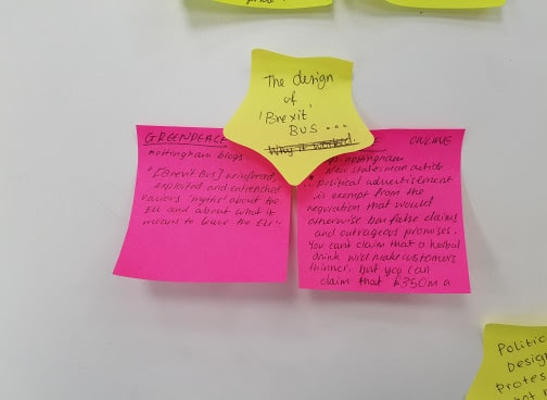
The design of Brexit bus:
-
“[Brexit bus] reinforced, exploited and
entrenched various ‘myths’ about the EU and about what it means to leave the
EU”
-
“political advertisement is exempt from the
regulation that would otherwise bar false claims and outrageous promises. You
can’t claim that a herbal drink will make customers thinner, but you can claim
that £350 million a week will go to the NHS instead of the European Union”
The protest/Greenpeace bus:
-
“the bogus £350 million NHS claim is being
covered over with thousands of questions for the new government from Leave and
Remain voters”
Why Greenpeace bus worked:
-
“They [posters] will continue to be used…
because people cannot raise up their computer monitors in a convention, carry
them in a demonstration, plant them on lawns, or paste them onto walls”
-
Shepard Fairey “One of the reasons doing work on
the street is still very important to me is that it demonstrates my commitment
to actions in the real world, not just in the digital realm”.
Ken Garland:
IMMERSIVE/REAL WORLD – POSTERS/BANNERS
-
Nuclear Disembardment campaign. Political design
is not new.
-
Spoke to a younger audience.
-
Used a different medium. Banners/physical. Had
audience interaction – people wrote their own slogans.
On CND:
-
“there was a black and white style already,
because it was cheapest. It was simple, you could say almost crude, printing
technique – silkscreen – for the posters”.
-
“there were so many hundreds of them [banners]
and when we marched along Whitehall it looked like an invading army”


No comments:
Post a Comment