Within
my essay I explored how effective is the use of graphic design within political
campaigns and protest, and within my practical I utilised what I had learned
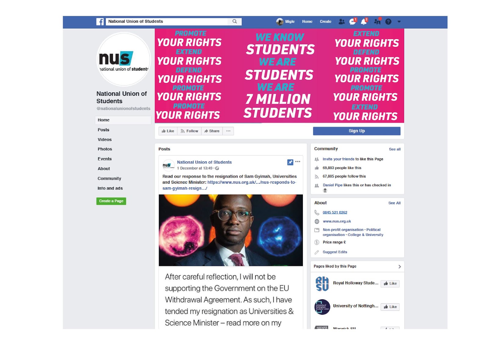
and applied it into creating a campaign for the National Union of Students
(NUS). The design elements that my essay discussed were technique, trends,
medium, and emotion; these design elements were experimented with and exercised
in the design process of my NUS campaign. Social media also played a heavy
role, as the target audience for the campaign were students.
My
theoretical research revealed that the use of design technique has a positive
impact on the way political messages are communicated and received by the
audience, as well as how they relate to a wider audience. My campaign utilised flexible
branding design techniques, much like the ‘Britain Stronger In Europe’ campaign
that was discussed in my essay. This allowed me to create a range of graphics
for the campaign, making the potential to appeal to individual subjective views
more likely, and consequently, appeal to a wider audience. This also allowed me
to create graphics that were directed at specific groups within my target
audience, and therefore make the message of my campaign more accessible and
personal in the way it was communicated to and received by the audience.
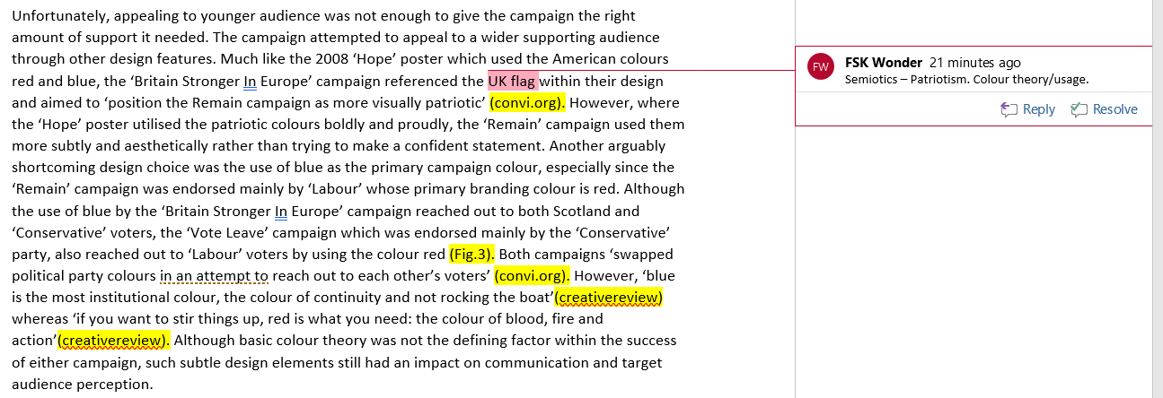
The use of design trends had been discovered, within my theoretical research, to appeal to younger audiences, and in turn affect the popularity and publicity of political campaign and protest. My practical design process researched into current design trends of 2018 and the projected design trends of 2019. Similar to the 2008 Obama ‘Hope’ poster, which utilised underground and ‘OBEY’ design trends of the time, the 2018/19 design trends that were applied within my campaign were bright colours, bold typography, use of gradients and minimalism. By utilising the design trends within my campaign, I was able to produce outcomes that are visually appealing and attractive to my target audience, and consequently make them more likely to show their support for the campaign and increase its publicity.
My theoretical research also looked at the use of a real-world medium within political campaign and protest, and how it allows the message to be spread to a wider audience, as well as bringing it more public attention. My campaign translated the real-world medium into merchandise. By creating campaign designs that could be applied to t-shirts, tote bags and badges, I gave my target audience the ability to show their support for the campaign in the real-world. Doing this increases the impressions the campaign message has on the wider audience, as the merchandise can be worn in the real-world and therefore be seen by members of the public. This also brings the campaign more publicity, as the merchandise can act as an invitation for other target audience members to inquire what the campaign is about.
Finally, my theoretical research showed that the use of emotion can increase audience interaction and personal connection with political campaigns and protests. Within my campaign, I utilised emotive and inclusive language such as the words ‘your’, ‘we’, ‘students’ and ‘rights’. In doing this, I was able to speak to the target audience on a more personal level and engage them with my designs. Similar to the 2008 Obama poster that used simply the word ‘Hope’, which allowed the audience to project their own desires and hopes onto it, my campaign posters also allow the audience to project their own desires for which ‘rights’ should be ‘protected, extended and defended’. By having a flexible brand system and being able to adapt the graphics of the campaign to directly acknowledge groups within my target audience, also increases the audiences’ interaction and personal connection with the campaign.
Social media has also played a role within both my theoretical research, and consequently my practical outcome. Social media had been revealed within my essay to affect distribution, publicity and audience interaction. As the target audience for my NUS campaign were students, social media was utilised because student audiences are more active online and social media than other audiences. By creating gifs, still posts and image headers the campaign message can be more noticed and engaged with within social media platforms. Consequently, this increases the distribution and publicity of the campaign.
Overall, I am satisfied with the success of my practical outcome. I believe it utilises the theoretical research I had learned from my essay and applies it clearly to the design process and outcomes of my practical. I believe I was able, in my essay, to reveal what design elements are most effective in creating empowering and strong political graphics and, in my practical, demonstrate how those design elements be easily be applied. However, although I am happy with my practical outcome, I believe that technically it could have been more developed. My theoretical research clearly laid out what can only be described as a set of ‘rules’ for successful political design, and although I applied those rules within my practical, I believe that they could have been developed further. The way in which I applied those rules feels quite obvious, and I could have improved if I had designed something that was a little more unexpected or unseen in political design. Nevertheless, I believe my essay and practical has been successful in terms of establishing and exploring a clear link between graphic design and political campaigns and protest.