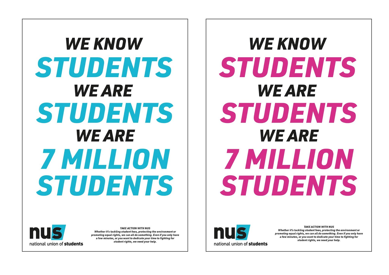
- I think the blue and pink work well together, I don't think you should use just one of those, use them both. The idea of a flexible brand system is very current.
- I really like the illustrations - I think that works well with the message.
- You should do merchandise like tote bags, stickers, badges etc. Would appeal to your audience.
- In the '7 million students' poster, I prefer the one where the word 'students' is in white. That makes it stand out more and is more legible.
- Look into 'OBEY' and 'They Live' film. It is typographical and minimal. May be relevant to what you want to achieve.
- If you're going for a minimal approach, make sure it is very central to your designs. Make the typography the focus.
- The practical so far seems to work well with the essay. Keep on doing this.
- I like your chosen typeface, I think it works well with the existing NUS brand.
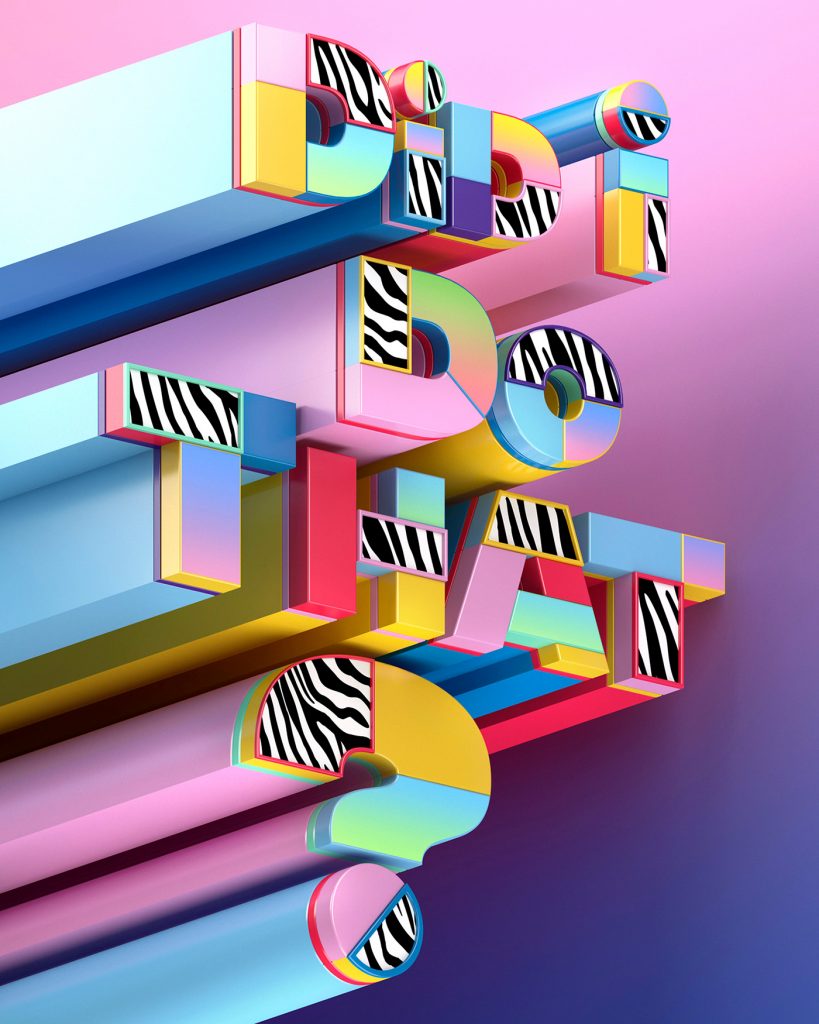
- Maybe look into the 3D lettering again, and try and improve it. I think it has potential.
Friday, 30 November 2018
Thursday, 29 November 2018
NUS - Initial Ideas
 |
| Initial sketches and considerations of what the campaign should include - and how it will link with the essay. |


I also looked at typography, from my design trends research I also found that bold typography is very popular currently, and expected to be in the 2019 year to come. That is why I explored a series of bold typefaces, I looked into having them capitalised as I am planning on having my designs fairly typography orientated, so by having capital letters it would bring more excitement and attention to the designs. I looked at some of the typefaces applied over the colours I had extracted from the logos, to see how they will work alongside the colours. In the ends I decided on the typeface 'URW DIN Black' because I thought it looked the most sleek, clean and clear to read. I also thought it was quite close to the typeface used within the 'NUS' logo therefore it would make for another clear visual connection for the audience, between the NUS brand and the campaign.
 |
| As well as design trends, I found from my essay that emotion and emotive language is effective within design. This is why I wanted to make sure that my campaign includes emotive language that would resonate with my student audience, especially since I am planning to have typography as a focus within the designs. From my research into NUS I found that they have policy and liberation zones that I want to bring attention too, as well as some key words I picked out. 'Protect', 'Extend', and 'Defend' caught my attention because I think it is a very positive and easy to understand statement about student rights. The use of words such as 'your', 'student' and 'we' I feel would be very emotive as it would speak personally to students, and make them feel more welcome to join the NUS. Throughout my design process, I will look to use they key words to make sure my designs are emotive and connect with the audience. |
After having the basics of a colour palette and typeface, I started with composition and layout designs, as well as explored applying some of the other design trends I had read about:
 |
| For the main NUS UK branch, I choose the colours blue and pink from the palette. This was because the blue is already known to the audience, because it is the blue in their logo. And the pink because they are trying to implement that into their branding, by having it as the primary colour for their new 'Totum' card, so I thought I could help the implementation of this new colour into their branding by having it alongside the already know blue. |
 |
| The choice of blue and pink, I also found to create a very interesting and bold contrast, that would catch the audiences attention. I looked at incorporated some 3D type to create depth, another design trend. |
 |
| I am focusing on typography because I feel like it makes a bold statement, it makes the audience focus on the language within the posters. Here I looked at 3D as well to create depth and something more visually engaging for the audience. I found that the 3D type makes the words slightly illegible, which draws away from the language and message, something I really want to focus on. |
 |
| Custom illustrations was another design trend I found to be currently popular. I briefly looked into having some form of minimal illustrations to represent the 'togetherness' and 'we' ideas that are present within the language within the posters. I thought this might make the posters more visually engaging as I felt that typography might not be enough, however, looking at these I feel like the illustrations actually make the typography stand out less, and this is not something I want. |
 |
| Some more 3D type experimentations, as well as different emotive language, to try and engage the viewer/audience. The use of 'Join and Take Action!' I feel is not interesting or original enough, as there have been plenty of campaigns that ask someone to 'Join' a movement, I feel as if stating why they should join (eg. protect, extend, defend your right) should be more obvious. |
 |
| Combining 3D type and minimal illustrations. I quite like these visually as they are exciting, however, I feel like these are a bit too chaotic and do not make the emotive message focal or clear enough. |
 |
| Looking at extending the message to specific students rights, such as LGBT+ rights, and adapting the design to suit those. However, I find that keeping to the same colour story is more effective as it makes it more visually cohesive, as well as not being too overdone. Rainbow colours for LGBT+ are too expectant and not visually exciting anymore. Whereas the pink and blue together feel far more fresh and clean, inviting the viewer to draw their attention to the poster. |
 |
| I felt like I was too attached to having a coloured background, so I decided to invert it and have a white minimal background, with the colour palette applied to the text only. I quite like this as it is very clean and minimal, however, I feel like it is not bold or attention grabbing enough. |
 |
| Some more experimentations with white backgrounds, and different applications of colour. The 'LGBT+' in this case is not very legible, and also alongside the pink and blue colour usage, the design looks too chaotic. It is not clear about the hierarchy of information, and what is the focal point of the poster. |
 |
| These I find really lovely as they are clean, minimal and visually very pleasing. The colour usage is not overwhelming or chaotic. However, like previous explorations with the white background, the poster is not bold or loud enough, I feel like it would not grab the attention of a passer by if it was pasted onto a wall. I thought something like this but inverted back into the coloured background could be more effective. |
 |
| Here is the same as the previous poster, I really like the composition and layout, as well as the hierarchy of information. But I don't feel like it is exciting or attention grabbing enough. |
 |
| After all my experimentations and explorations, this is the design I feel is most appropriate and effective. The use of colours is really bold and exciting, and would definitely grab the attention of my audience. The layout, composition and hierarchy of information I feel is effective because it brings a focus onto the emotive language, and highlights the 'key' terms I wanted to highlight from the start really well. |
 |
| Here are posters with my other slogan with the same design story as the previous one. Again, I feel like this is most effective and appropriate, and has the potential to be applied to a variety of campaign materials really easily and cohesively. I think I will make the branding of the campaign a flexible one, so that I could use both the pink background poster and the blue background poster. Not only because I cannot choose which I believe works best, but also because I think they are more effective and engaging when together, and they have the potential to work really well online and on social media in the form of gifs and animation. |
Tuesday, 27 November 2018
Research - Current Design Trends & Techniques
https://www.behance.net/gallery/60273889/2018-Design-Trends
https://graphicmama.com/blog/graphic-design-trends-2019/?
https://www.picmonkey.com/blog/graphic-design-trends-of-2018
https://www.creativebloq.com/features/graphic-design-trends-for-2019
https://www.behance.net/gallery/71481981/2019-Design-Trends-Guide
The current and most mentioned design trends I've noticed by looking at all the above sources:
(ones that may also be relevant to my project)
- Bright Colours
- Gradients
- Duotones
- Open compositions (no frames/borders)
- Custom Illustrations
- Depth/ 3D typography
- Bold typography
- Minimal/Simple


Sunday, 25 November 2018
NUS - Revised Brief
After my feedback session, I decided to re-write my brief so that it would fit my new practical project direction. As the feedback suggested, I will not re-design the NUS logo, but instead I will design a campaign for them that highlights and brings to attention to students their policies and campaigns, and the fact that they are not just a student discount organization.

Friday, 23 November 2018
NUS - Practical Brief, Initial Ideas and Feedback


Feedback:
- I think the NUs logo and branding is okay, it is quite professional/serious which is what it needs to be. I don't think you should re-design their logo.
- Maybe just do a campaign for them, they don't need a re-design, they just need their message heard in a different way.
- You could do a social media campaign - that would be appropriate for students.
- You could do something like the 'Dig In' box we got when we were first-years. Like a starter pack with NUS that could have posters, sticker etc in it to appeal to students.
- Students love merchandise, and its free promotion. You could also have tote bags, t-shirts etc.
After the feedback session I was quite relieved, because I myself felt that the direction I was going in was not the most relevant. The initial logo re-design sketches I had were very weak, and I didn't seem to have any original or effective ideas in my opinion. So when my feedback suggested that I leave behind the re-design idea and just focus on making a campaign I started to feel more confident. I also really responded well with the idea of creating merchandise and content for social media, as I felt this would be very appropriate for the student audience I am aiming to design for.
Thursday, 22 November 2018
Essay Planning


Introduction:
-
What is Graphic Design? What is political
campaigns/protest? How do they link?
-
What I will discuss: design elements, trends,
target audiences, social media, mediums, history.
Obama ‘Hope’ Poster:
VIRAL/PRINTED/ONLINE - POSTER
-
Most well-known/iconic.
-
Social media first came into play in politics.
Drove the campaign.
-
Spoke to a younger audience. Poster came from
‘underground’. Followed ‘Obey’ trend.
-
Was emotive/inspiring.
The design of ‘Hope’ poster…
-
“Allying a powerful simplicity to an optimistic
message, the poster achieves a perfect synthesis of image and text to
communicate the essence of the Obama vision”
-
Shepard Fairey “I felt I could implicitly
portray Obama as established enough to be worthy of an idealised portrait,
almost like a two-dimensional statue – patriotic and American rather than being
of any specific race.”
-
“helped mobilise a grass-roots movement”
-
“hope is promised but nothing is specific. It
invites the viewer to project their own desires into the icons’ imagination.”
-
“It showed Obama thoughtfully looking upwards
and to the right, into the distance towards the future hopes of the nation. It
symbolised the promise of things yet to come, yet to be imagined”
Power of Social Media…
-
Shepard Fairey “The ubiquity of ‘Hope’ image
demonstrates that grass-roots activism makes a difference and that none of us
are powerless.”
-
“One person can cause a rippling effect in
activism and forever change the destiny of a country”
-
“made technology integral to strategy,
generating unheralded levels of online advocacy.”
-
“Fairey’s creation was originally underground…
showcasing the possibilities of simple design that inspires and provokes.”
Argument…
-
“Once held up as an example of how a political
poster could bring about positive change in the world, now it perhaps serves as
a warning that its all just propaganda in the end.”
-
Shepard Fairey “Digital tools have in some ways
helped activism, but in other ways they have resulted in people doing things
that are merely convenient and symbolic only for them. It is not necessarily
meaningful in terms of how they participate in effecting change.”
Britain Stronger In’:
VIRAL/PRINTED/ONLINE – LOTS OF MERCHANDISE
-
Clean and minimal. Followed current trends. Had
a ‘flexible’ brand identity.
-
Spoke to younger audience. Utilised social
media.
-
Was not very emotive, didn’t reach the right
audience.
The design of ‘Remain’:
-
“Blue is the most institutional colour, the
colour of continuity and not rocking the boat”
-
“If you want to stir things up, red is what you
need: the colour of blood, fire and action.”
-
UK Flag references “aimed to position the Remain
campaign as more visually patriotic, attempting to challenge Vote Leave’s
positioning as the campaign of sovereignty and national pride”.
-
“It worked as one of those flexible brand
systems we all love these days”
-
“[Remains] crisp graphic lettering… is
juxtaposed with Pro-Brexit Wetherspoon beermats”
-
"The use of blue by Stronger
In also reached out both to Scotland and to Conservative voters. The Leave
(majority Conservative) and Remain (majority Labour) campaigns swapped
political party colours in an attempt to reach out to each others’
voters."
-
Why it didn’t work: Target Audience/Emotion
-
“Vote Leave succeeded because it persuaded its
audience to do so. It designed a campaign which wasn’t about aesthetic value –
it was about making an emotional connection.”
-
“The urge for action was stronger than the
desire for continuity. And the respective campaigns proved that emotional will
beat rational every single time.”
-
“Vote Stay might have been a bit needy, but
would have at least provided the opportunity to tell a more emotive story. It
would have played up the divorce factor that was clearly on people’s minds.”
-
“pro-remain posters… spoke only to those already
sympathetic to the cause.”
Social Media:
-
“One reason social media is effective is that it
engages young voters… twitter and facebook have energized young voters, which
has had a profound impact on elections.”
‘Brexit’ Bus and Greenpeace protest:
PHYSICAL/REAL WORLD – BUS/OBJECT
-
Used a different medium. Bus/physical. Had
audience interaction.
-
Was emotive through their use of slogans.
Greenpeace protest also used public opinions.
-
Greenpeace challenged/questioned the original
bus.
The design of Brexit bus:
-
“[Brexit bus] reinforced, exploited and
entrenched various ‘myths’ about the EU and about what it means to leave the
EU”
-
“political advertisement is exempt from the
regulation that would otherwise bar false claims and outrageous promises. You
can’t claim that a herbal drink will make customers thinner, but you can claim
that £350 million a week will go to the NHS instead of the European Union”
The protest/Greenpeace bus:
-
“the bogus £350 million NHS claim is being
covered over with thousands of questions for the new government from Leave and
Remain voters”
Why Greenpeace bus worked:
-
“They [posters] will continue to be used…
because people cannot raise up their computer monitors in a convention, carry
them in a demonstration, plant them on lawns, or paste them onto walls”
-
Shepard Fairey “One of the reasons doing work on
the street is still very important to me is that it demonstrates my commitment
to actions in the real world, not just in the digital realm”.
Ken Garland:
IMMERSIVE/REAL WORLD – POSTERS/BANNERS
-
Nuclear Disembardment campaign. Political design
is not new.
-
Spoke to a younger audience.
-
Used a different medium. Banners/physical. Had
audience interaction – people wrote their own slogans.
On CND:
-
“there was a black and white style already,
because it was cheapest. It was simple, you could say almost crude, printing
technique – silkscreen – for the posters”.
-
“there were so many hundreds of them [banners]
and when we marched along Whitehall it looked like an invading army”
Friday, 16 November 2018
'Understanding Media Semiotics' by Marcel Danesi
"The internet has become, above all else, a highly effective medium of advertising" P170.
"...They are effective because they reflect 'shifts' already present in popular culture" P179.
"Business firms, political parties and candidates, social organizations, special-interest groups, and governments alike advertise routinely in various media to create favourable 'images' of themselves in the minds of the people" P179.
"The repetition of advertising in different media of the same system is a primary strategy used to strengthen product recognizability" P194.
"Outdoor signs are used because people pass by the signs repeatedly. In addition, large, colourful signs attract attention." P194.
"Print media now use computer and telecommunications technologies to create, produce, and print different version of the same ad text. Called 'selective binding', this enable advertisers to stylize versions of their texts for selected groups of readers." P194.
"The Internet has, moreover, the advantage that it is simultaneously an impulse, a directional, and an interactive medium" P194. Impulse - it indulges viewers to click ads. Directional - allows viewers to buy products/services. Interactive - allows viewers/consumers and manufacturers/services to interact.
"Advertising has become the fuel for an entertainment-driven society that seeks artifice as part of its routine of escapism from the deeper philosophical questions that would otherwise beset it." P199.
"...while the Internet may seem to be under the control of media moguls, it has also made it possible for virtually everyone to join into the fray and gain an audience for his or her 'voice'." P217.
Thursday, 15 November 2018
'Persuasion in Advertising' by John O'Shaughnessy and Nicholas Jackson O'Shaughnessy
"with repeated exposure comes familiarity, and with familiarity usually comes increased liking" P3.
"Persuasion differs from 'invlfuence'. Although persusasion is a way of influencing, all ways of influencing are not persuation. People can influence the beliefs, values, wants or actions of others withough making any deliberate attempt to do so." P6.
"One way to persuade people to change is to show that what they believe or the way they act is not in line with reference group norms" P11.
"Persuastion motivates people into action through influencing beliefes and desires" P25.
"Advertising that resnates emotionally stands more chance of inducing a change in beliefs and values/motives/wants/desires than one based on logic alone." P27
"emotion is advertising" P28.
"advertising should connect with what concerns the audience" P28.
"stories create a warm feeling of reassurance which tends to mute criticism" P31.
"Although an appeal that resonates emotionally will get attention and even trigger action, there is sually a need to show that the proposed actions is socially appropriate and can be 'rationally' justified'. P36.
"The art of successful political agitation lies in selecting the issues that best resonate with the public". P36.
"Symbols can susbstitute for vast quantities of direct information and in this lies their power to influence" P38.
"But when a symbol is loaded with ambiguity, the power of symbolism can lie in its very vaguenss since the audience has more freedom to interpret and map onto it their deepest concerns. P38
"
Research - National Union of Students (NUS)
'Who We Are' - https://www.nus.org.uk/en/who-we-are/
'We champion students to shape the future of education – and create a better world. Education is the defining factor in creating a fairer, more prosperous society, and students are the hope for the future of education.


'How We Work' - https://www.nus.org.uk/en/who-we-are/how-we-work/
'NUS has five policy zones covering broad areas of issues affecting students:


'We champion students to shape the future of education – and create a better world. Education is the defining factor in creating a fairer, more prosperous society, and students are the hope for the future of education.
This is students driving change
We promote, defend and extend student rights. We fight discrimination, isolation and injustice through campaigning and targeted action. We harness the collective power of students through collective and democratic representation.
This is making sure students can thrive
We head up a prosperous and sustainable student movement that means we can give practical information on all the issues that matter to students. The NUS extra card saves students money and brings important commercial influence.
This is representing the realities of students’ lives
We bring together evidence-based campaigns and student-led democracy. We represent students’ interests nationally and develop research that influences national policy. We take on all the issues that affect students’ lives now and in future.
We are the National Union of Students.
We know students. We are students. We are 7 million students.'


'How We Work' - https://www.nus.org.uk/en/who-we-are/how-we-work/
'NUS has five policy zones covering broad areas of issues affecting students:
Policy zones
-
Further Education
-
Higher Education
-
Society and Citizenship
-
Union Development
-
Welfare
The role of each zone is to lead a portfolio of work, enable in-depth and wide ranging research and discussion on issues important to students, and deliver campaigns and work programmes relevant to that area.
Each zone is led by a vice president elected at the NUS National Conference and a committee elected at the Zone Conference held in late October.
Liberation
There are four liberation campaigns that exist autonomously within NUS to defend the rights of marginalised and underrepresented groups.
Being autonomous means each liberation campaign hosts their own annual conference and determines their own policy.
Nations
NUS works across the UK on individual education needs of each nation. Find out more about our activities in:
-
NUS Scotland
-
NUS Wales / UCM Cymru
-
NUS USI
Charity and commercial services
Completing the NUS Group is NUS Charitable Services and NUS Services Ltd. These specialised entities focus on maximising benefit to students' unions.'


'TOTUM, the new name for the NUS extra card, brings you over 200 UK student discounts and comes with 1-year FREE ISIC unlocking over 42,000 international discounts.
Get your TOTUM card now.
1, 2 or 3-Year Cards
Choose from a 1-year card for just £12, a 2-year card for £22 or a 3-year card for only £32. Many discounts are online only so you can’t get them without your TOTUM card.
Over 200 UK discounts on the brands you love and local independents.
TOTUM has the best student discounts around that you can use online and in store. Top brands include:
- 10% off at the Co-op
- 10% off ASOS
- 25% off Odeon student priced tickets
- Up to 40% off at Las Iguanas
- 42,000 International Discounts
TOTUM, powered by NUS extra, comes with 1 year free ISIC. The ISIC card is the only internationally accepted proof of certified student status. The International Student Identity Card (ISIC) is your access to fantastic discounts and services at home and around the world. Your ISIC card is accepted in over 130 countries, as well as at your favourite UK high street retailers, restaurants, attractions, and more
- Exclusive discounts on worldwide flights, including STA Travel
- Discounted rates at hotels & hostels worldwide
- Recognised by universities, academic institutions, student organisations & national governments worldwide
- Endorsed by international organisations such as UNESCO and the European Council
It provides over 42,000 international discounts in over 130 countries including:
- 30% off Lonely Planet
- 20% off Eurolines
- 5% off Homestay
Head over to the ISIC website to find all international discount
Gourmet Society Bolt-on
With TOTUM, you will never have to pay full price again! Enjoy 2-for-1 meals or up to 50% off meals at around 7,000 top restaurants including big name chains like La Tasca, Bella Italia, Strada, Café Rouge, and Walkabout plus thousands of local favourites by simply showing your TOTUM Gourmet Society card. All this can be yours for only £7 for a 12-month membership, £12 for 2 year membership or £15 for a 3 year membership. After purchase, Gourmet Society will contact you with details, from November 5th 2018, the logo will no longer be printed on the card. All discounts and redemptions must be done via the Gourmet Society app.
For Students
We work hard to get the best deal for students. TOTUM is a key part of this, with revenue generated being fed directly back into key student initiatives in Students' Unions' across the country.'

Subscribe to:
Comments (Atom)