 |
| Initial sketches and considerations of what the campaign should include - and how it will link with the essay. |
After my initial idea sketches, first things I did was look at the design elements that could help me define the visual language of the project. I extracted colours from the existing NUS logo's and decided that utilising those colours would be most appropriate for this project, so that the campaign was not too incoherent from the existing NUS branding, as well as to create a more obvious link between NUS and my campaign. I found that the colours from the existing logos were bright and fun, which also re-confirmed my choice to use them going onwards, because from my research into current design trends I had found that bright colours are popular, and are projected to be continued into the year 2019.
I also looked at typography, from my design trends research I also found that bold typography is very popular currently, and expected to be in the 2019 year to come. That is why I explored a series of bold typefaces, I looked into having them capitalised as I am planning on having my designs fairly typography orientated, so by having capital letters it would bring more excitement and attention to the designs. I looked at some of the typefaces applied over the colours I had extracted from the logos, to see how they will work alongside the colours. In the ends I decided on the typeface 'URW DIN Black' because I thought it looked the most sleek, clean and clear to read. I also thought it was quite close to the typeface used within the 'NUS' logo therefore it would make for another clear visual connection for the audience, between the NUS brand and the campaign.
 |
| As well as design trends, I found from my essay that emotion and emotive language is effective within design. This is why I wanted to make sure that my campaign includes emotive language that would resonate with my student audience, especially since I am planning to have typography as a focus within the designs. From my research into NUS I found that they have policy and liberation zones that I want to bring attention too, as well as some key words I picked out. 'Protect', 'Extend', and 'Defend' caught my attention because I think it is a very positive and easy to understand statement about student rights. The use of words such as 'your', 'student' and 'we' I feel would be very emotive as it would speak personally to students, and make them feel more welcome to join the NUS. Throughout my design process, I will look to use they key words to make sure my designs are emotive and connect with the audience. |
After having the basics of a colour palette and typeface, I started with composition and layout designs, as well as explored applying some of the other design trends I had read about:
 |
| For the main NUS UK branch, I choose the colours blue and pink from the palette. This was because the blue is already known to the audience, because it is the blue in their logo. And the pink because they are trying to implement that into their branding, by having it as the primary colour for their new 'Totum' card, so I thought I could help the implementation of this new colour into their branding by having it alongside the already know blue. |
 |
| The choice of blue and pink, I also found to create a very interesting and bold contrast, that would catch the audiences attention. I looked at incorporated some 3D type to create depth, another design trend. |
 |
| I am focusing on typography because I feel like it makes a bold statement, it makes the audience focus on the language within the posters. Here I looked at 3D as well to create depth and something more visually engaging for the audience. I found that the 3D type makes the words slightly illegible, which draws away from the language and message, something I really want to focus on. |
 |
| Custom illustrations was another design trend I found to be currently popular. I briefly looked into having some form of minimal illustrations to represent the 'togetherness' and 'we' ideas that are present within the language within the posters. I thought this might make the posters more visually engaging as I felt that typography might not be enough, however, looking at these I feel like the illustrations actually make the typography stand out less, and this is not something I want. |
 |
| Some more 3D type experimentations, as well as different emotive language, to try and engage the viewer/audience. The use of 'Join and Take Action!' I feel is not interesting or original enough, as there have been plenty of campaigns that ask someone to 'Join' a movement, I feel as if stating why they should join (eg. protect, extend, defend your right) should be more obvious. |
 |
| Combining 3D type and minimal illustrations. I quite like these visually as they are exciting, however, I feel like these are a bit too chaotic and do not make the emotive message focal or clear enough. |
 |
| Looking at extending the message to specific students rights, such as LGBT+ rights, and adapting the design to suit those. However, I find that keeping to the same colour story is more effective as it makes it more visually cohesive, as well as not being too overdone. Rainbow colours for LGBT+ are too expectant and not visually exciting anymore. Whereas the pink and blue together feel far more fresh and clean, inviting the viewer to draw their attention to the poster. |
 |
| I felt like I was too attached to having a coloured background, so I decided to invert it and have a white minimal background, with the colour palette applied to the text only. I quite like this as it is very clean and minimal, however, I feel like it is not bold or attention grabbing enough. |
 |
| Some more experimentations with white backgrounds, and different applications of colour. The 'LGBT+' in this case is not very legible, and also alongside the pink and blue colour usage, the design looks too chaotic. It is not clear about the hierarchy of information, and what is the focal point of the poster. |
 |
| These I find really lovely as they are clean, minimal and visually very pleasing. The colour usage is not overwhelming or chaotic. However, like previous explorations with the white background, the poster is not bold or loud enough, I feel like it would not grab the attention of a passer by if it was pasted onto a wall. I thought something like this but inverted back into the coloured background could be more effective. |
 |
| Here is the same as the previous poster, I really like the composition and layout, as well as the hierarchy of information. But I don't feel like it is exciting or attention grabbing enough. |
 |
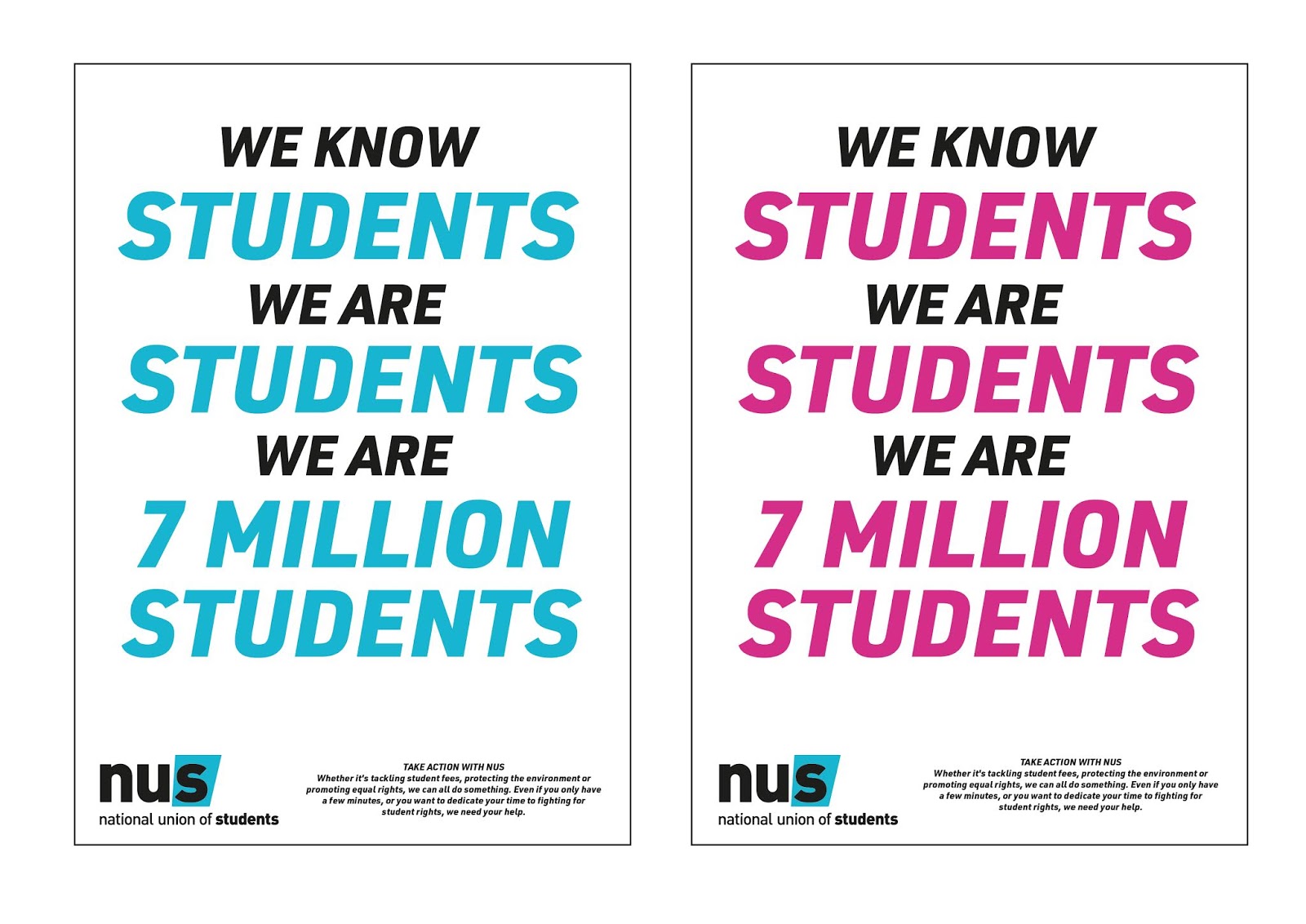
| After all my experimentations and explorations, this is the design I feel is most appropriate and effective. The use of colours is really bold and exciting, and would definitely grab the attention of my audience. The layout, composition and hierarchy of information I feel is effective because it brings a focus onto the emotive language, and highlights the 'key' terms I wanted to highlight from the start really well. |
 |
| Here are posters with my other slogan with the same design story as the previous one. Again, I feel like this is most effective and appropriate, and has the potential to be applied to a variety of campaign materials really easily and cohesively. I think I will make the branding of the campaign a flexible one, so that I could use both the pink background poster and the blue background poster. Not only because I cannot choose which I believe works best, but also because I think they are more effective and engaging when together, and they have the potential to work really well online and on social media in the form of gifs and animation. |


No comments:
Post a Comment